I love stats :P So when i found out that LastGraph3 can take your last.fm data and make it into a cool looking graph… I so had to do it :P
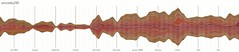
I have been using last.fm for about 2 years now and the data collected is enough to start creating fancy graphs :P One glance at the graph and I could so easily point out songs that I liked and explain the increased frequency of listening to certain artists.
For example (in the last year), Consistent artists who I listen to: Kishore Kumar, K.K. and Shaan
Spikes for certain songs:
(Time frame – Artist – Song – Album)
July 07 – Mithoon – Mausam – The Train
Sep 07 – Mustafa Zahid – Toh Phir Aao, Tera Mera Rishta – Aawarapan
Oct 07 – Shail Hada – Saawariya – Saawariya
Nov 07 – Mohit Chauhan – Tum Se Hi – Jab We Met
Mar 08 – Atif Aslam – Pehli Nazar Mein – Race
June 08 – Rashid Ali – Kabhi Kabhi Aditi – Jaane Tu… Ya Jaane Na
Not to mention that I can easily pick incidents and emotions in the graph but wont be putting that list up anytime soon ;)